Nov 16, 2022
Signifiers in UI Design
Signifiers are an irreplaceable part of UI designs. Let us explain why and how you can use them.
Author


Book a call
Table of Contents
“Good design requires, among other things, good communication of the purpose, structure, and operation of the device to the people who use it. That is the role of the signifier.” — Don Norman, Grand Old Man of User Experience
Let me start with an example :
Suppose you visited your friend’s new apartment. Now imagine yourself parking your car in the basement without these signifiers! 🧐

I know it’s frustrating, right?😩
Therefore, signifiers add to the user's experience and the duration of their action.
💡 A signifier is additional information supporting an affordance and communicating where the action should occur.
Signifiers in UI Design 🤔
As designers, we include visual clues in a mobile/web interface design. So it’s easier for the users to discover the actions and tasks that need to be taken.
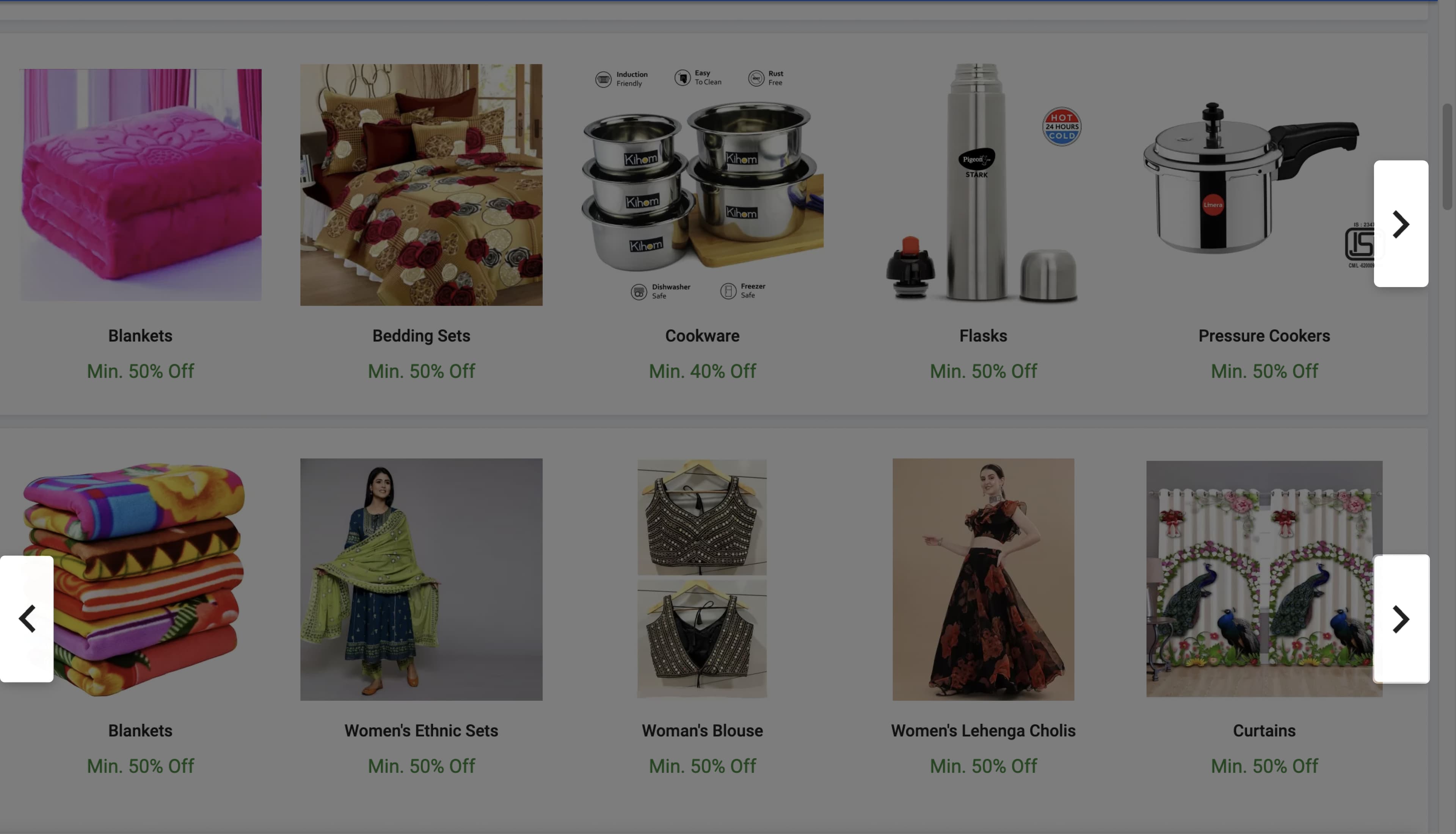
In the web app screen bottom, these arrow signs on both rows indicate that this is a scrollable carousel. In the first row, only one arrow is on the right side, which signifies that only one side scroll is possible.
While in the second row, there is an arrow on both sides. Therefore, it means that it is scrollable back and forth.
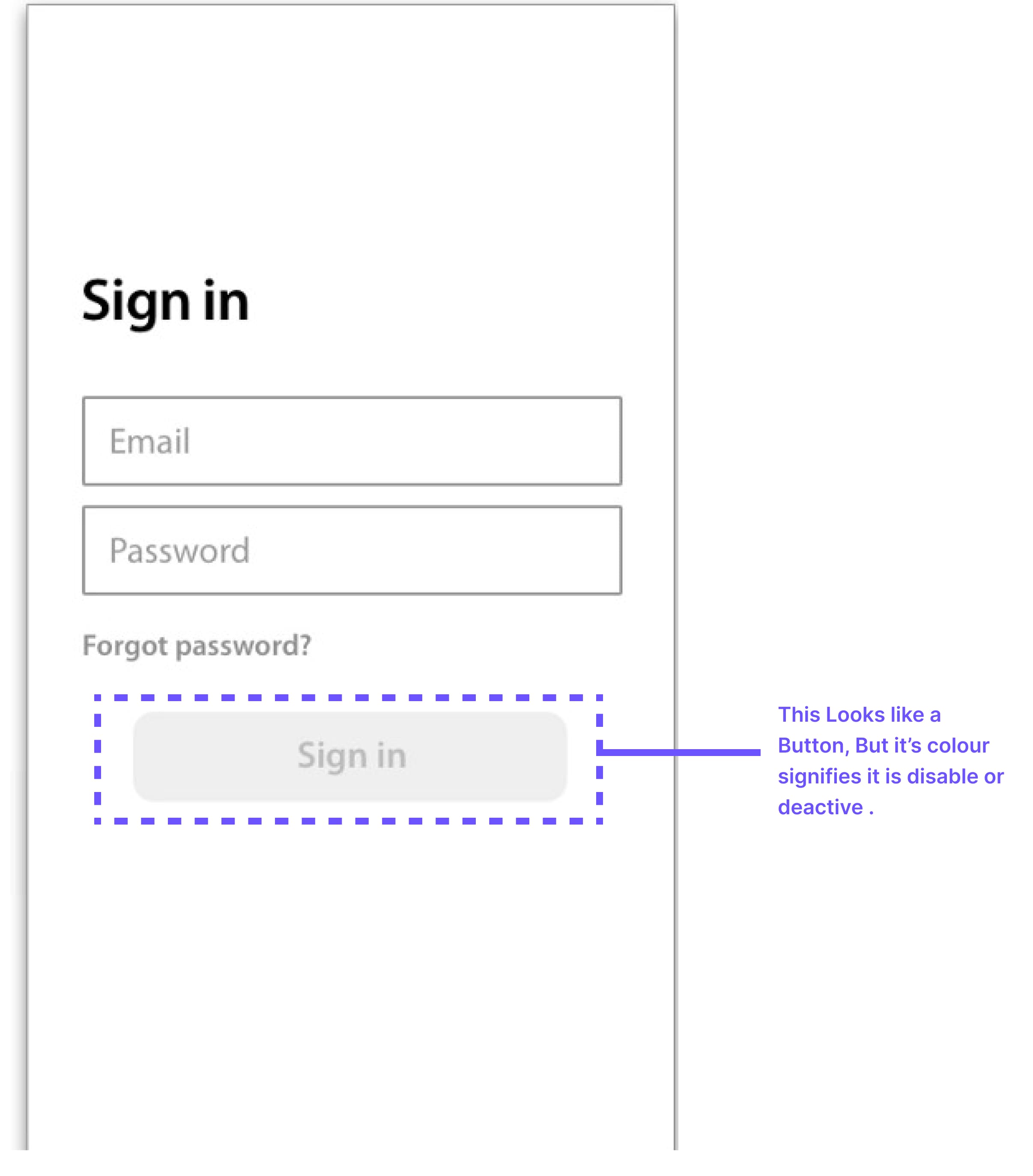
On the mobile app screen shown above, the sign-in text inside the box looks like a CTA, but the color signifies that this is inactive or disabled. This is how different types of signifiers communicate with their users.
So What Is Affordance?
According to Norman (1988), affordance is the design aspect of an object which suggests how the object should be used, a visual clue to its function and use. In short, affordance refers to the properties of the thing, those fundamental properties that determine how the item (object /sign) could be used.
For example, if the chair affords to sit or stand on it, that is its affordance, but if someone kept the reserved sign on the chair or attached the balloon to it, that signifies that you can not sit on that chair.
You can find more detailed information about affordance. You’ll get to know it in the “What is Affordance” blog, so stay tuned…

Types of Signifiers
The signifiers in UI are generally categorized into:
- Icons
- Colour
- Text
- Sound
Let’s talk about these in brief:
1. Icons
Iconic or symbolic signifiers are used when we have graphical images to represent the action based on the similarity of appearance. There are too many ways for designers to incorporate signifiers in their design; one of the ways is using icons.
For example, the heart icon for your favorites, the home icon to go to the home page, magnifying glass for search, and many more.
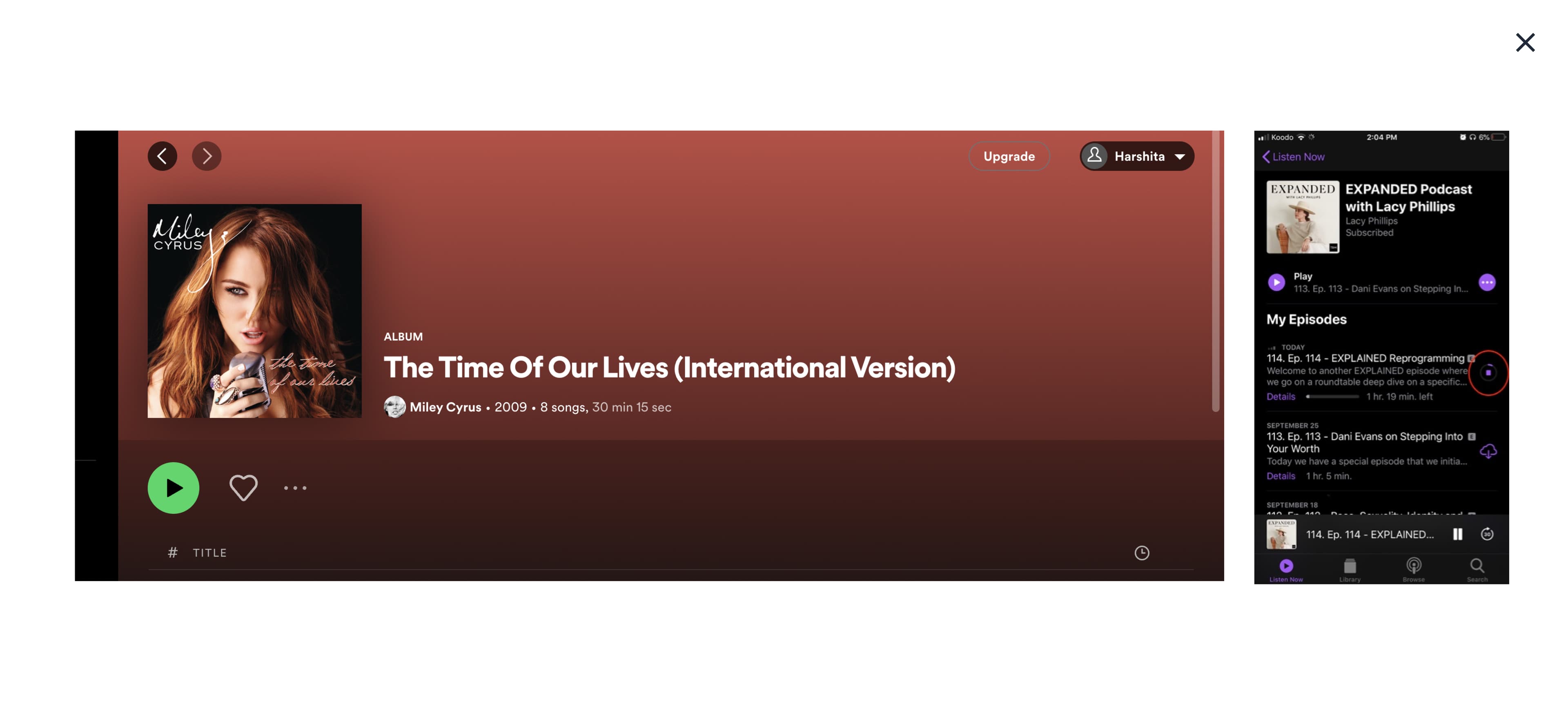
In the image above, on the right is the Spotify web screen, where we can see many symbolic actions, like a heart shape for Like and Add to Favorites. The triangle inside the green circle signifies the Play action.
This is familiar to us from our previous experiences. The two small arrows on the top left signify the moving to the previous and next screen, but its shades show the possibility of action, i.e., only moving to the previous screen is possible and not to the next screen.
In the above-left screen, the downloading-loading icon signifies how much the song has been downloaded.
That’s how icons without text can communicate the possible action with their users, considering their psychology and experiences.
2. Colors
Usually, designers use primary, secondary, and tertiary colors/or no colors to convey the importance of the action.
Designers use color and hierarchy as signifiers to get user attention toward the most preferred necessary action.
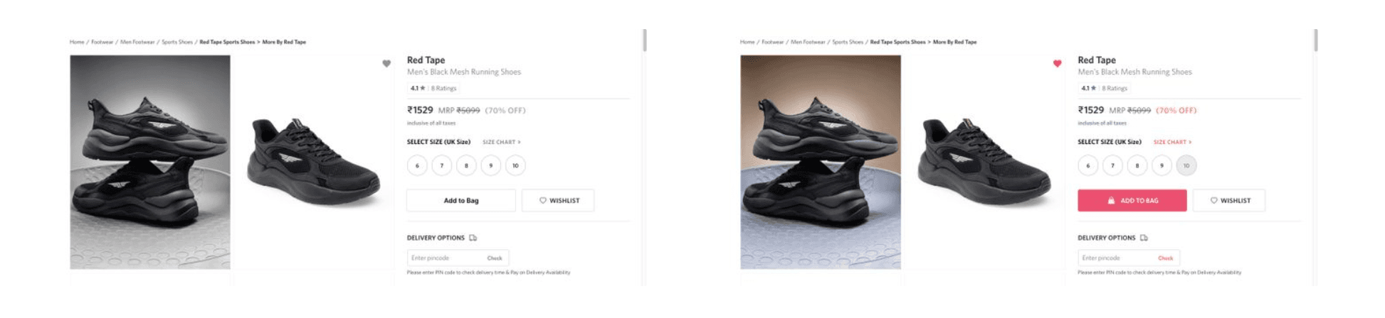
In the above images, one is on a greyscale, while the other has color used and perceived differently. In grey, it's tough to identify which action is primary, secondary, or even disabled. Even if you try, it will consume most of the time. While in the other image, with proper use of colors and hierarchy, a user can identify the prominent actions possible, what is already selected and what is disabled.
That's where colors play their role Users can communicate with the pieces of information.
3. Text
These signs have an arbitrary or conventional link. Text generally comes along with icons/graphical images for a better understanding of the information.
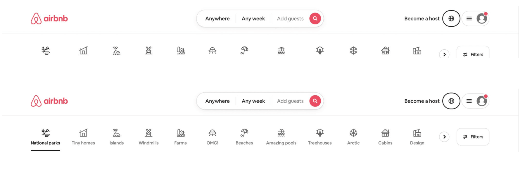
I've shared above the header of Airbnb. We all might have visited the web app many times before. Considering the first image, icons in the row without the text are a bit hard to identify what each icon defines with location or hotel type. Users might have to strain to understand the meaning of the icons, which will increase the time of action, and maybe some users will find this process frustrating and eventually leave the site without booking.
Now let’s consider the second image (the real Airbnb web app) with the graphical representation they have used the supported text for better communication and quick action possible.
So whenever we try something different with the visuals or unknown by the users, we should always give a piece of backhand information. This will be a sign of a good design where users don’t have to put any effort into understanding any actions.
4. Sound
Most apps use AI voice features to guide the user toward the action.
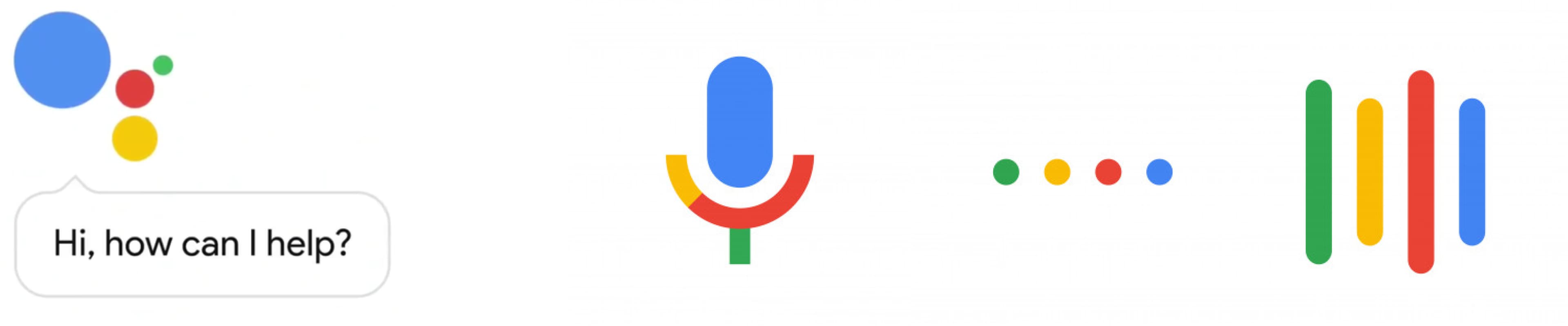
We all are familiar with google assistant and the search via mic feature in our phones, which signifies how smartly the designers have used an auditory and visual sense to represent the action. The wave movement of those four color dots indicates the active mode of the recorder i.e., when the user can start speaking. That’s where we are making technology responsive to almost all sensory receptors.
How to use Signifiers best 🤔
Along with having a good knowledge of design principles, designers always take care of these basic points.
- Give clear Indications - Designers always clearly indicate in their design where and how people should interact with the app. Should they tap sideways or scroll upward or downward? If it’s voice-controlled, use a combination of visual (e.g., lights) and auditory signifiers (e.g., vocal cues) to guide them.
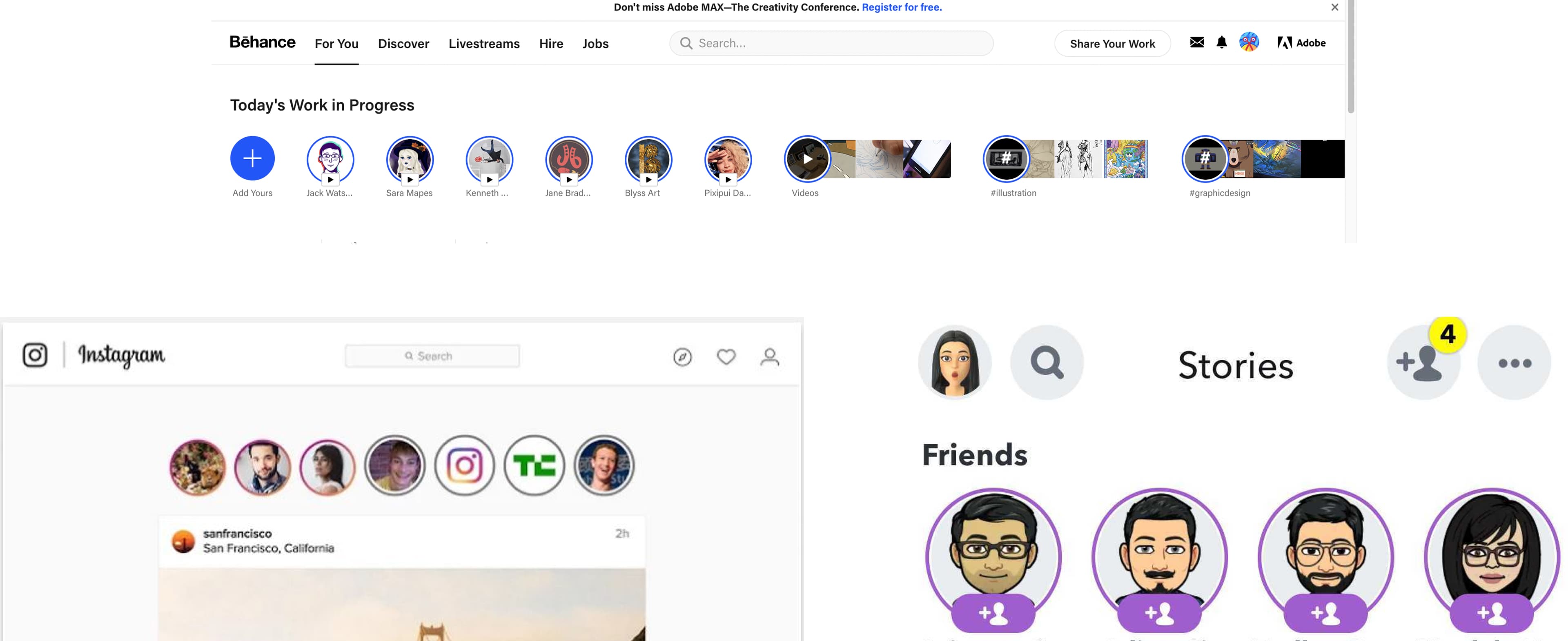
- Familiarity is the Key - It would be good to use signifiers consistently, bringing a pause in the users’ minds to think it would not be a good option. Most users are familiar with using social media apps like Instagram, WhatsApp, and Facebook. Very few people also use Behance for design inspiration. All these platforms have one common feature of posting stories, and visually they all look similar(a circle with an image and highlighted border). This is mainly because Jacob's Law states that “Users spend most of their time on other sites. This means that users prefer your site to work the same way as all the other sites they already know.”
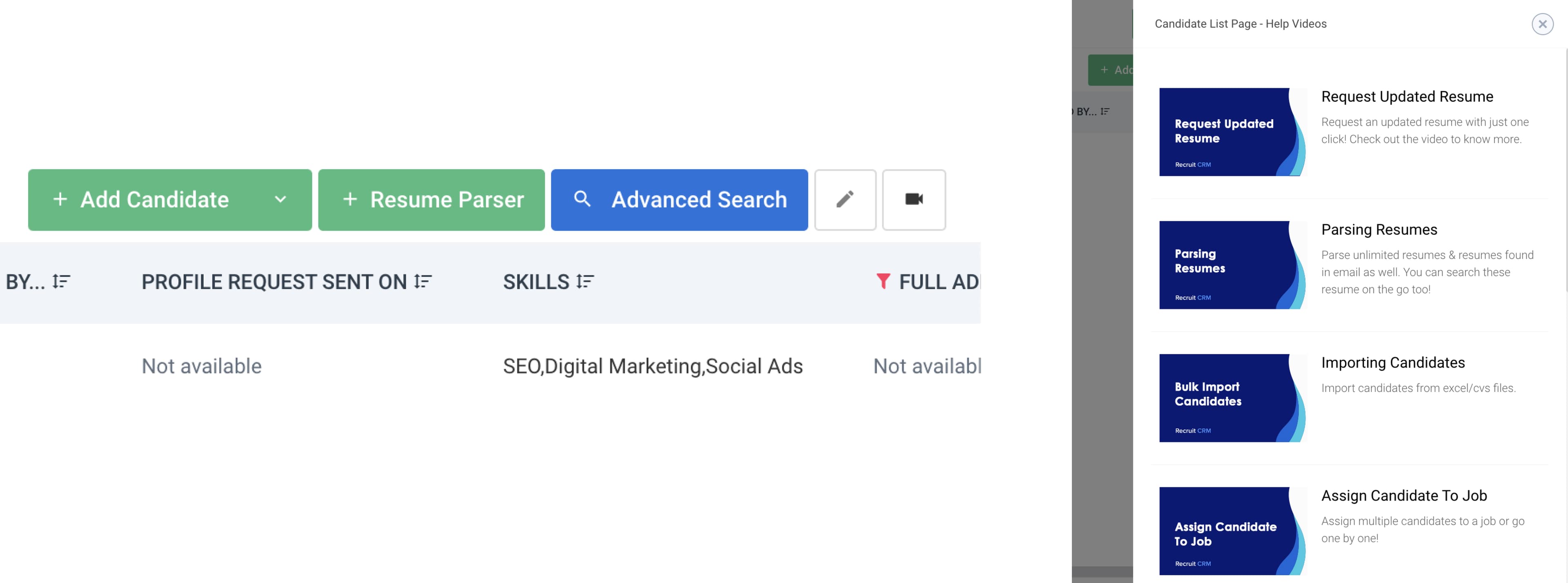
- Be aware of false Affordances - Perceived affordance and actual affordance should match. For example, the envelope icon should function as an email us button and not reveal a physical address. So recently, came across this website where we can see the video camera icon (in the left image). It is perceived as some video calling signifier, but when clicked, the screen appears (on the right) which has information/help-related videos. It would have been better if the icon (signifier) had been more prominent for the users to understand that this is for the help/information video for candidates. Therefore, it is always suggested to use the right signifiers and to be aware of false affordances.
- Empathize - It is always suggested that designers empathize with their users, as users will create a mental model of the product based on the system image. Therefore, it is always advised to let you know the purpose with significant clues. Empathizing is the first step to starting the design. It's essential to know about the users, and designers should use icons, text, vocabulary, colors, and features as per their users’ needs. Designers should never design how they like to see it. They should always try to consider what the user wants from their product.
I hope this information was helpful to you. Thank you.
Related Articles.
More from the engineering frontline.
Dive deep into our research and insights on design, development, and the impact of various trends to businesses.

May 28, 2026
How to Modernize Your Fintech App Without Rebuilding Everything
This blog gives fintech leaders a practical framework for modernizing a fintech app without rebuilding it. It covers system audits, module-level decision making, phased API and integration-led execution, compliance protection, and team model selection.
May 28, 2026
Why Your First AI Pilot Needs Success Metrics Before Development Begins
95% of AI pilots deliver zero measurable profit impact. Learn the critical importance of establishing concrete success metrics and operational constraints before writing any code to ensure your project scales.
May 28, 2026
AI in WealthTech: Building Scalable Portfolio Management Platforms for Predictive Investing and Risk Forecasting
Discover how AI-native platforms are revolutionizing WealthTech by enabling real-time, predictive investing and advanced risk forecasting. Learn the core operational pillars and engineering priorities for building a scalable portfolio management system.