Crafting Gauges with geekyants_flutter_gauges

What is a Gauge? 🎚️
At its core, a gauge is a graphical representation of a value within a predefined range. It typically consists of a visual indicator, such as a needle or a bar, that moves along a scale to indicate the current value. Gauges are widely used in applications across various domains, including automotive, industrial control systems, health monitoring, and more.
Coming to GeekyAnts_flutter_gauges, it provides you with a widget to display data on a linear scale. Use this widget as a base to craft high-quality gauges to represent data or have some progress data in your app.
It uses Flutter’s Render Objects under the hood to let you create stunning-looking gauges or indicators as required.
In this blog, we cover the basic usage of Linear Gauge.

Features That the Linear Gauge Offers 🧰
The features offered by linear gauges are as follows:
- Ruler Style Customization
- Shape & Widget Pointers Customization
- Multiple Orientation
- Custom Curve
- Animation
- Interactivity
Getting Started with Linear Gauge
Add the dependency to your pubspec.yaml:
Import the package in your Dart code:
Begin utilizing the LinearGauge by incorporating it with the essential RulerStyle parameter, ensuring rulerPosition is set to RulerPosition.bottom. This simple setup will provide you with the foundational gauge configuration.
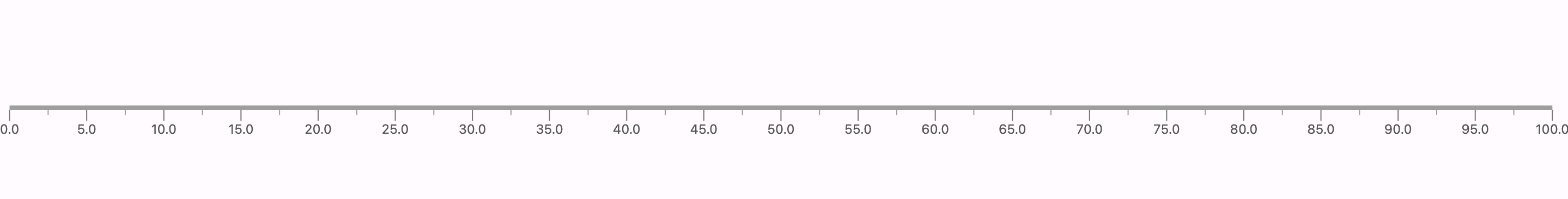
The above code gets you the basic gauge, which will look something like the above picture. We need to start exploring more so that we can get something better of it. Let us dive in and explore some more examples you would want to use on your application.
Now before we move forward, let us familiarize ourselves with the gauge’s naming and the properties
The gauge contains 4 major things.
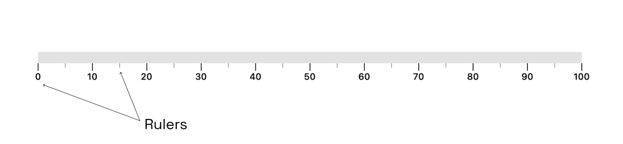
- Rulers
These encompass the primary and secondary scales on the gauge. They can be customized by adjusting therulerPositionto be above or below the gauge, or even positioned directly on the gauge by setting therulerPositiontoRulerPosition.center. Additionally, we can show or hide the primary, secondary, and label components. Furthermore, it is possible to invert the rulers, set offsets, and modify the height and width of primary and secondary rulers to achieve desired visual effects. GaugeContainer
The
gaugeContaineris the main Container above the scales of the gauge. You can customize this by changing the color, thickness, radius and adding linear gradients to this.ValueBars & Pointers
The
ValueBarin the LinearGauge is the component that displays the actual value of the gauge. It has properties such ascolor,offset, andthicknessthat can be customized to fit your needs.
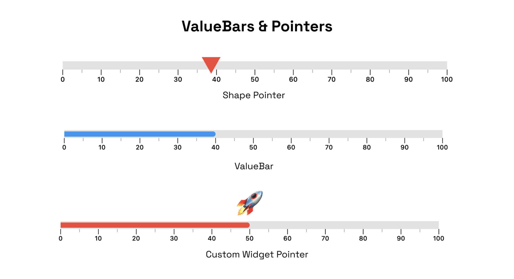
RangeLinearGauge
The
RangeLinearGaugeclass enables you to customize the ruler appearance in theLinearGauge. You can display multiple ranges by providing a list ofRangeLinearGaugevalues, and customize the color, start, and end values to match your requirements.
Customization Examples
Now that we are a bit familiar with the naming, let us explore some advanced customization examples to tailor your LinearGauge according to your application's requirements.

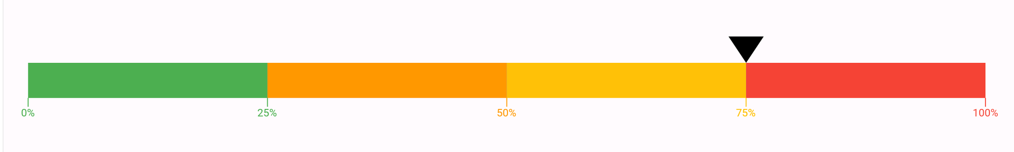
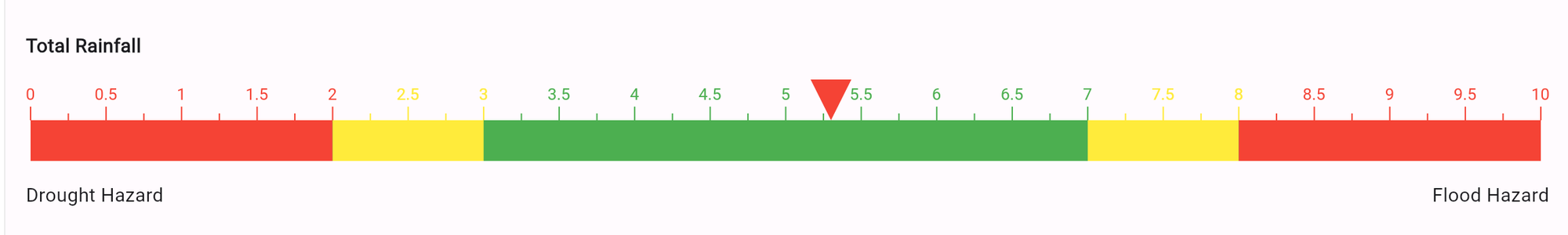
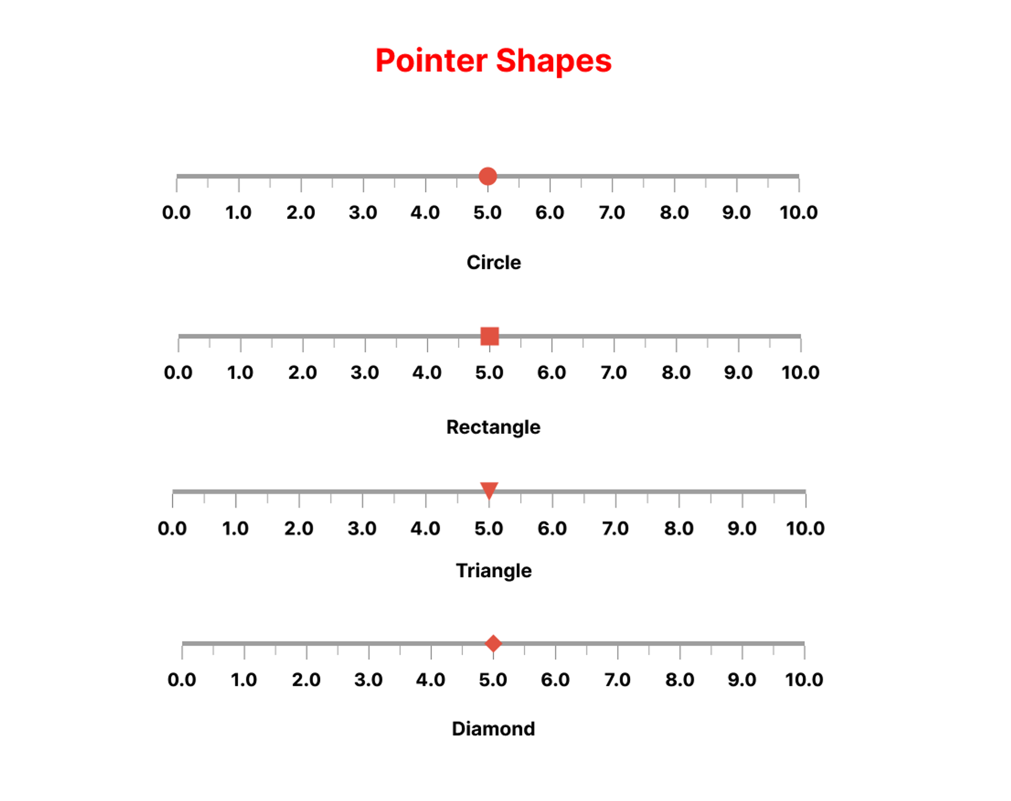
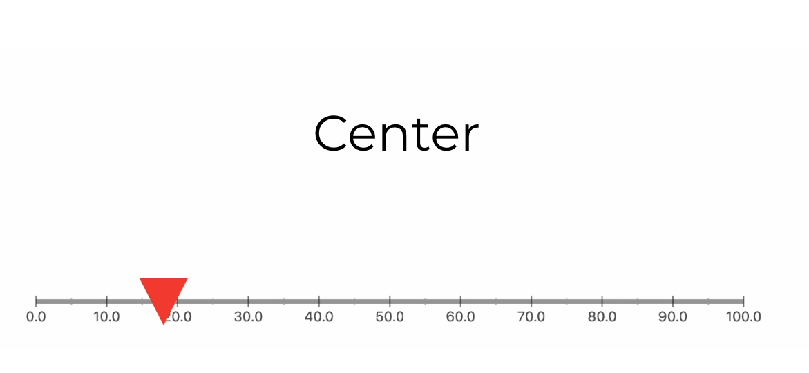
In our first example, we will cover the creation of a basic LinearGauge with a gradient background and a pointer. To incorporate a pointer into your gauge, utilize the pointer parameter, which accepts a list of pointer objects. We will set the pointer shape to a Triangle, but feel free to experiment with other shapes such as a Circle, Triangle Rectangle, or Diamond.
You can further customize the appearance of your gauge using properties available in the Linear Gauge Playground within the demo app. Let us dive into the implementation.
Here, the PointerPosition.center signifies that the pointer is centrally aligned with respect to the GaugeContainer. You can set various alignments using PointerPosition depending on your requirement.
Now coming back to the ruler, you can customize the look of the GaugeContainer using the linearGaugeBoxDecoration property. In our case, we will set it with a thickness of 10 and a borderRadius of 30 and add a LinearGradient to our liking.
Apart from this, we will also hide the primary & secondary rulers along with the showLabel tag set to false.
Adding Interactivity & Animations ✨
Animations are built with the package. You can use animationDuration and animationType to customize it more to your liking.
The animationDuration parameter enables you to define the duration for the pointer's animation until it reaches its designated position.
And animationType allows you to define a Curve from Flutters' built-in animation curves.
For Interactivity, we can declare a double and change its value on the pointer’s onChanged event.
Doing this will make the gauge interactive, and the output will be something like the below gif.

GitHub's Language Gauge
Let us explore another example by replicating a feature from GitHub. On GitHub repository pages, there is a gauge displaying the languages used in that specific repository. We will aim to recreate this functionality using our package.
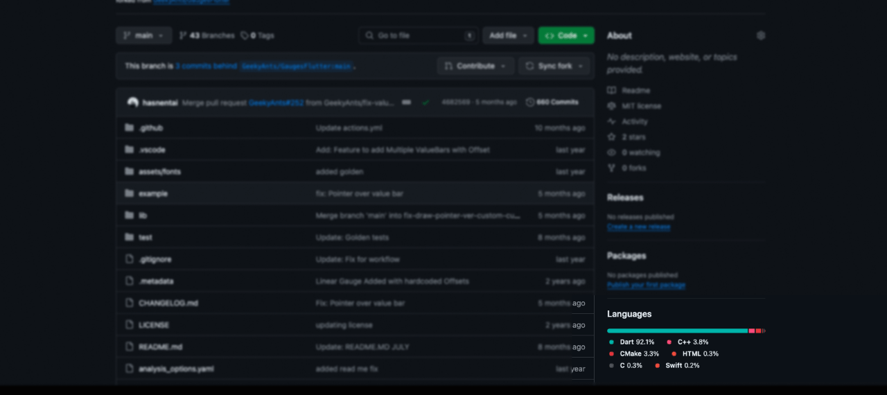
For this example, we will utilize RangeLinearGauge instead of individual Pointers to achieve a visually striking linear gauge. The rangeLinearGauge property accepts a List of RangeLinearGauge objects, each specifying the start and end values, color, and borderRadius. By assigning unique colors to each RangeLinearGauge and applying borderRadius of 30 to the first and last elements, we can craft the desired look.
Note: To achieve a spacing similar to GitHub's language bar, consider adjusting the start values to begin from +0.5 of the last value for each RangeLinearGauge. This tweak will introduce a gap between the
RangeLinearGaugeelements, mimicking the GitHub-like appearance.
Moving to the Complex Stuff
Now that we know how Linear Gauges work and how to build simple things, let us go on and build something more complex. In this section, we will go over building a thermometer.
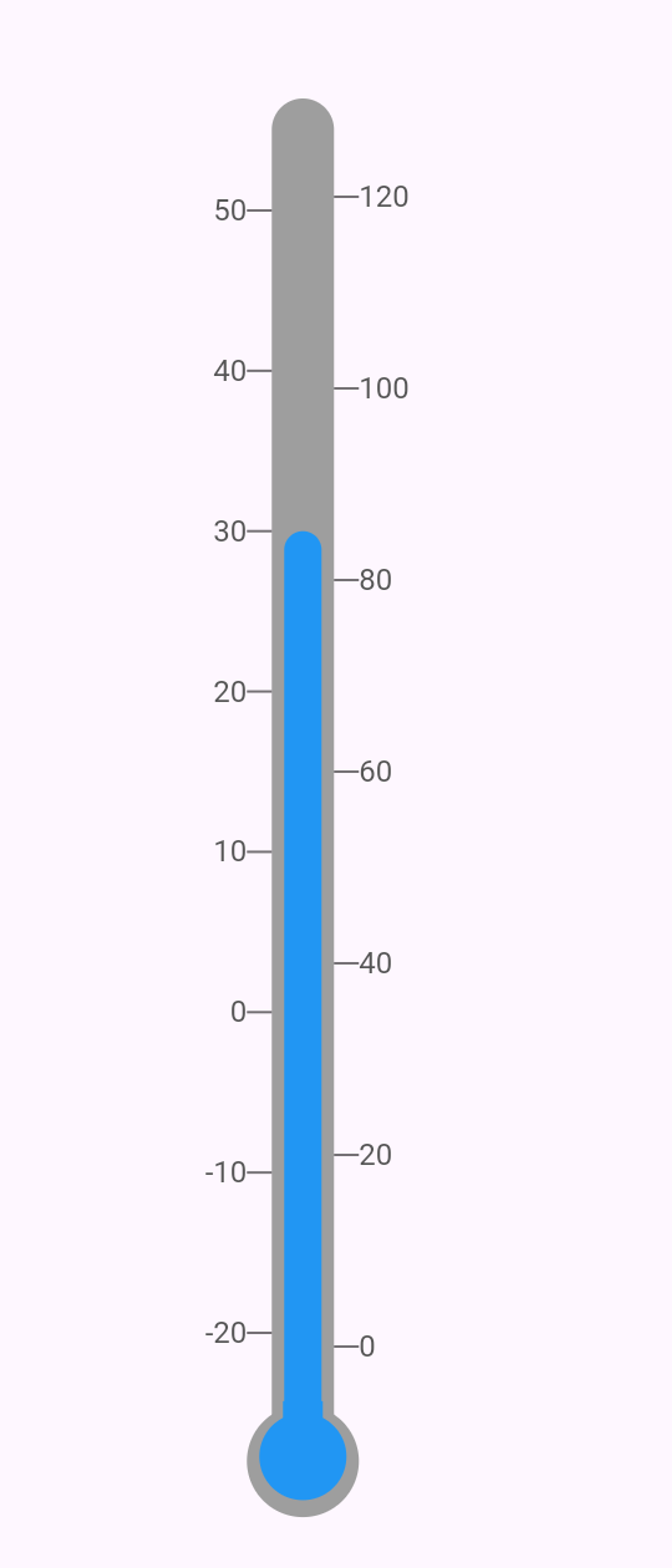
We will employ two separate gauges nested within a Row widget to construct a thermometer gauge. This approach allows us to visually represent the thermometer's layout effectively. Combining two gauges side by side can achieve the desired thermometer visualization. Refer to the image below for a clearer understanding of the layout.
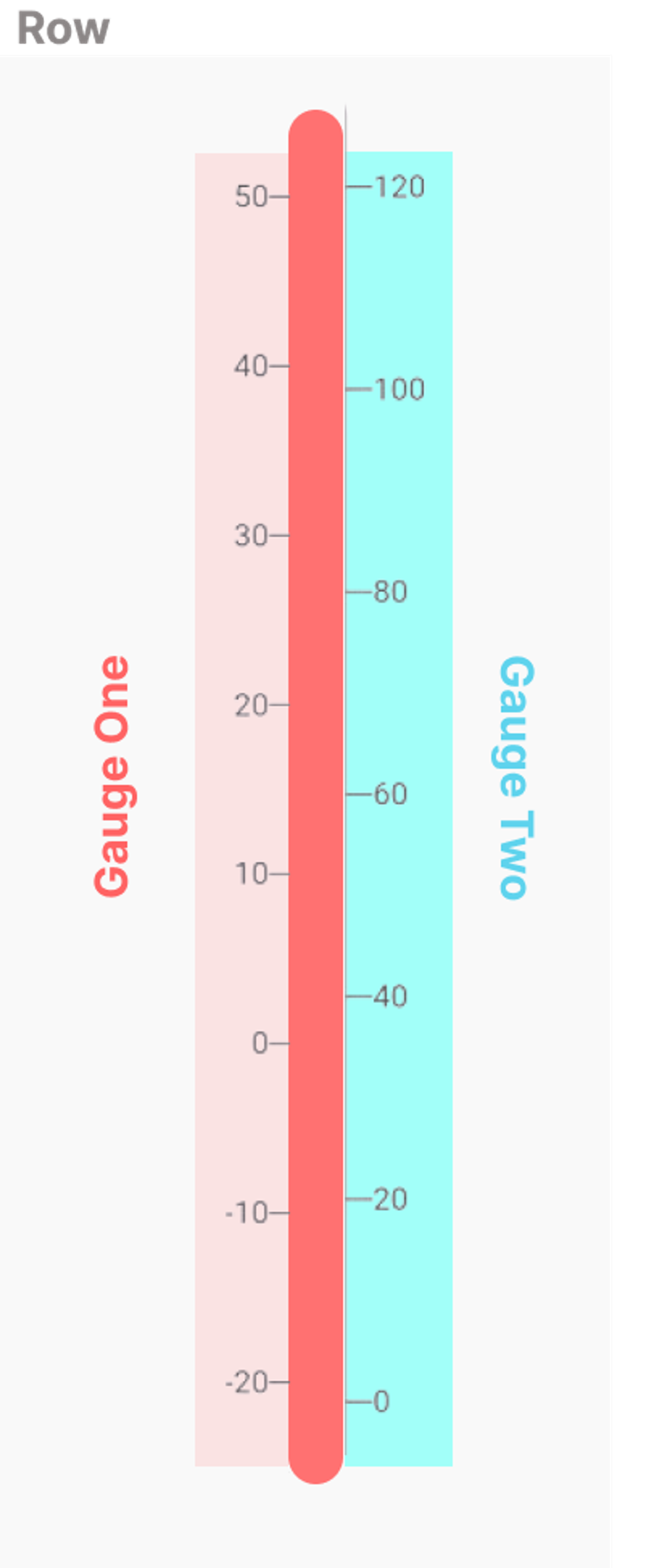
The first Gauge has its rulers on the left, and the second one has it on the right. The GaugeContainer of the second Gauge is hidden, and we use Gauge one’s container to show progress or values. Apart from this, we extend both the gauges by satisfiable values to align the gauge perfectly with the pointers.
Note: To make the Gauge vertical, we need to set the
gaugeOrientationto vertical and also change therulerPositionto left or right.
The pointers both belong to the First gauge and have separate alignment as required.
Let us have a look at the complete code now:
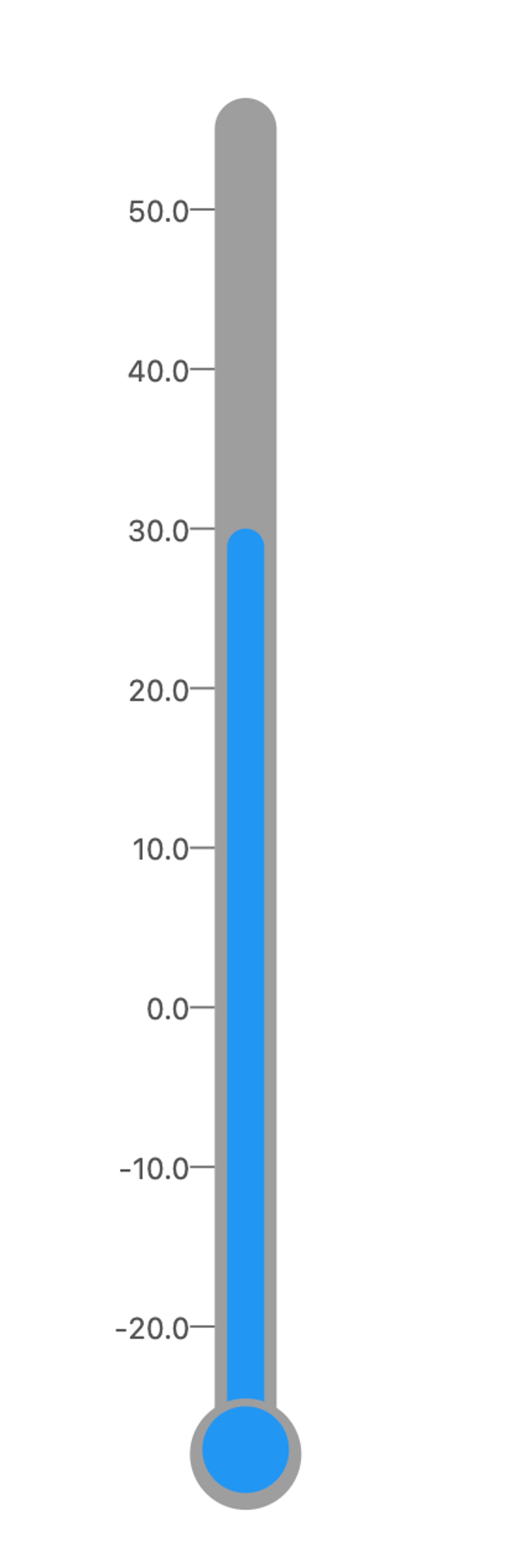
Once the layout is set, we can move on to the other properties. For the bulge on the end, we attach two pointers to the Gauge One by changing their alignment as required.
Now, we would be able to see something like this:
To cover the small gap we can add one more pointer so that the gauge looks correct. Here is the entire code for the thermometer:
Looking to Explore Further?
These are just simple examples, visit https://gauges-showcase.vercel.app/ to view more examples of how you can create stunning Gauges with ease using LinearGauge.
We have just scratched the surface there is a lot to play around with, so try cloning the repository and get your hands dirty. PR and Issues are welcome on the official Github repository https://github.com/GeekyAnts/GaugesFlutter
Explore the power of geekyAnts_flutter_gauges! Leverage this tool to display data on a linear scale and create high-quality, visually appealing gauges for your app. The widget uses Flutter’s Render Objects, allowing for stunning designs.
Dive in and discover the basic usage of Linear Gauge today!